Thursday, August 21, 2014

Copper Embellished Beautiful Brushstrokes!

Yesterday I had a little free time to play with my newest "love", PTI's Beautiful Brushstrokes Kit. (You can no longer purchase this kit, but can read about it here.) This kit lets design the most beautiful cards. Kind of a "no brainer" when you use the images, designer papers and embellishments in the kit. I've made several cards with this kit, but yesterday I wanted to try something completely outside the box. 

Years ago I purchased a metal embossing kit at a Heirloom stamp show. It included all the necessary tools and supplies, including the copper, to create beautiful art using stamps and copper. I have have been thinking about trying this technique again, but my kit is long gone. So I simply pulled out my copper sheeting from my stash, a mouse pad and some dry embossing tools and set to work.

Here is my end result. Try as I might, I was unable to capture the differential shades of pinks and light purples in the copper with my digital camera. As with so many shiny projects, they always look better in "real life". Please use you imagination!
 (The synopsis of my technique follows below)
My Technique:
1. Die cut the my images from the copper using BB dies (and the Savvy Hello).
2. Then stamped the coordinating BB images onto the copper die cuts using Staz-On black ink.
3. Debossed stamped images, using the back side of a mouse pad. I used both a metal and a wooden stylus, and pushed the stamped portion of the flower image into the mat. I flipped the copper piece over as I went  to check my progress.
4. Satisfied with the debossed images, I held each piece with forceps and "carefully" apply flame and watched as the copper changed to tones of pink and a light purple. When I say "carefully",  I mean "slowly" while moving the flame around constantly. (I learned this after ruining several completed pieces with too much heat - it changes color quickly and if you don't remove the heat in time, the color rapidly changes to an ugly dull metal color that has no resemblance to copper whatsoever.
5. Allowed pieces to cool completely.
6. I chose to use black glossy card stock to highlight these images (and Copper Shimmer stock as a card base). To place images after all that hard work, you need to apply something to the back of these images to prevent them from compressing flat, especially if you plan to mail your project. I used E6000 glue, applied thickly to the back of the flowers and leaves before mounting to the black glossy.
7. I had forgotten how difficult it is to photograph black glossy card stock. It picks up so much light and reflection, and every speck of dust in the room...you practically have to photograph in the dark to get a decent image. The next time I will chose a different non-glossy background.

PS: If you decide to give this a go - be sure you are using true copper. There are different Craft Foils on the market made to look like copper (and other colors) but they are simply painted aluminum. They will work for debossing, up to the point of adding heat - then the paint simply burns off and you are left with another ugly project that you have poured your heart into - ask me how I know :)

Friday, July 25, 2014

Papertrey Ink July 2014 Blog Hop Challenge #2


Second project for the July Papertrey Ink July Blog Hop. This one focuses on the colors and pendant. I used Papertrey Ink Heart-2-Heart #5 stamp set. I hand stitched around the edges with red floss. Most supplies PTI - sequins from Pretty Pink Posh.


Papertrey Ink July 2014 Blog Hop Challenge

If it's the 25th, it's time for another Papertrey Ink Blog Hop!

This month's inspiration photo had so much going on - I tried to capture several elements in this submission for the hop. I just loved the little bird in the photo, as well as the banner and red plaid cloth pocket. I had so many ideas for this hop, but had time for only a couple cards.

Here is my first project:

A close up of the sweet little bird. I used a Memory Box die, PTI DP, and free cut the wing which is stamped with Garden Elegance.  HAPPY is from Wet Paint Cuts, which is cut apart and coated with Glossy Accents. The banner is free cut from PTI DP and card stock. For the tiny roses I used a rolled flower die from Impression Obsession. The long banner die with bows is from SSS. And the doily I confiscated out from under a cup of coffee at one of our favorite local eating establishments :)
And a close up of "birthday" die cut, which is "shadowed" with Red Poppy Cardstock (Thank you Betsy V for the lesson on that one :). Aqua Mist card base impressed with Canvas Impression plate.

Supplies:
All supplies PTI (except as indicated).


Sunday, June 29, 2014

ColorQ Challenge #248 Red White & Blue

I was delighted to see the ColorQ Challenge using a Red White and Blue palette this week.  I've been on a bit of a Patriotic/Independence Day kick this past week. I just love this Stars and Stripes designer paper pad from Doodlebug. It pairs up beautifully with the Red White and Blue stamp set from Papertrey Ink.
(I've made two other Red White and Blue cards this week which you can view here and here)
Here is the challenge:
And my entry:
Supplies:
Cardstock Papertrey Ink
Mirrorcard: Marco's Papers
Designer paper: Doodlebug Stars and Stripes, Let Freedom Ring
Stamps: Papertrey Ink Red White and Blue
Dies: MFT Rosette, PTI Tipped Tops, Double ended Banner
Ink: Papertrey Pure Poppy, Enchanted Evening

retrosketches #121 & ColorQ #248

Entering a couple of challenges I have not play in previously. Retro Sketches is one I have stalked for a long time through Laurie Willison's blog, and have often been drawn to the sketches. As a newly retired person, I hope to be playing along with challenges much more often.
Here is this week's sketch:
And here is my interpretation:

I am also linking this to this week's ColorQ Challenge #248


Supplies:
Cardstock Papertrey Ink
Mirrorcard: Marco's Papers
Designer papers: Doodlebugs Red White and Blue
Stamps: Papertrey Red White and Blue, Let Freedom Rink
Dies: Papertrey Tipped Top dies (star outline), Cover Plate: Stars, Aida Impression Plate
Ink: Papertrey Pure Poppy, Tsukeniko Silver Shimmer
Ribbon: JoAnne's


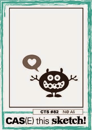
CAS(E) this Sketch #82 & ColorQ #248

 I ran across this new-to-me challenge blog at CAS(E) this Sketch. I've also been a Patriotic kick the past week or so, so this seemed like the way to let my card take shape.

This is this week's sketch:  


I flipped the sketch to create this card:

I am also linking this up to this week's ColorQ Challenge #248.


Supplies:
Cardstock Papertrey Ink
Mirrorcard: Marcos Papers
Designer paper: Doodlebug Stars and Stripes
Stamps: Papertrey Ink Red White and Blue
Dies: MFT Rosette, PTI Tipped Tops die, Linen and Canvas impression plate
Ink: Papertrey Pure Poppy, Fresh Snow; Detail White embossing powder


Monday, June 9, 2014

Make It Monday #168: Baby Wipe Stamping

Another quick post for a Papertrey Ink Make It Monday challenge from Ashley Newell.
You can see the video here. It required a little experimenting with color combos to come up with a baby-wipe "pad" that didn't turn out too muddy.

I stamped the flower along the edge of white card stock, over-stamped in black with the outline image then fussy cut down the right edge. The white panel is then layered over Hibiscus Burst card stock. Definitely want to try this again with other color combos.

Stamps and die: Pretty Peonies, Keep It Simple: Sympathy
Cardstock, ribbon: Papertrey
Ink: Hibiscus Burst, Harvest Gold, Aqua Mist; Versafine Onyx Black
KairserKraft pearls colored with Copics